Difference between revisions of "Projects:dtistatisticsfibers"
| Line 20: | Line 20: | ||
| − | <div style="width: | + | <div style="width: 40%; float: left; padding-right: 3%;"> |
<h3>Approach, Plan</h3> | <h3>Approach, Plan</h3> | ||
| Line 31: | Line 31: | ||
</div> | </div> | ||
| − | <div style="width: | + | <div style="width: 50%; float: left;"> |
<h3>Progress</h3> | <h3>Progress</h3> | ||
| Line 40: | Line 40: | ||
</div> | </div> | ||
| − | + | ||
<div style="width: 97%; float: left;"> | <div style="width: 97%; float: left;"> | ||
Revision as of 17:26, 17 August 2010
Home < Projects:dtistatisticsfibersStatistics on DTI data
Back to NA-MIC Collaborations, Utah2 Algorithms, MIT Algorithms, UNC Algorithms
DTI Fiber Tract statistics
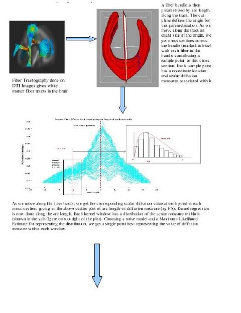
We work with DTI data and follow the complete pipeline motivated by Casey Goodlett's work. (The pipeline includes unbiased non-rigid registration of a population, followed by fiber tractography applied to the average atlas and mapping the atlas geometry back to individual subjects to get the individual DTI data.)
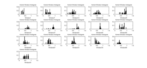
There are various visualization options available like viewing the data distribution histograms within cross sections (before and after applying the kernels), scatter plots to view the actual distribution of the DTI data, and more. These options help in further analyzing the best noise model and MLE to explain the distribution of DTI data along the fiber tract.
The tool will replace the command line interface that Fiber Viewer tool currently provides to do similar (though very limited) tasks. It will allow us to do comparison of DTI data inter and intra population. We are currently testing the results of the tool on data from neonates, 1 year and 2 year old subjects. Casey's Functional Data Analysis module is also being used to analyze the results generated above.
Key Investigators
- Utah: Anuja Sharma, Guido Gerig
Objective
The aim is to understand probabilistic models that can account for the behavior of water diffusion in white matter tracts. The long term goal is to use this to understand the changes in white matter structure with age, gender or a specific disease.
Approach, Plan
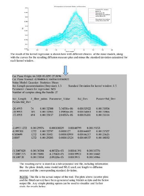
Various tract-oriented scalar diffusion measures are treated as a continuous function of fiber arc-length. To analyze the trend along the fiber tract, a command line tool performs kernel regression on this data. The idea is to try out different noise models and maximum likelihood estimates within kernel windows, such that they best represent the data and are robust to noise and Partial Volume effect.
Casey Goodlett's functional data analysis pipeline is then applied to this data. Here, multivariate hypothesis test is used to test for differences between populations and see if we get statistically significant results.
Progress
The first version of the command line tool is ready for upload into NITRC. It provides the flexibility to choose the scalar diffusion measure to be tested; a choice between Gaussian and Beta noise models and Mean, median or mode as MLE. It also incorporates several visualization options which help in analyzing the best noise models and the best representative statistics to explain the distribution of DTI data along the fiber tract. We are also working on integrating the tool into the Slicer environment. The tool can now work with UNC/UTAH .fib file format as well as the more popular VTK poly data format. The output is a csv file which can easily be used for further analysis and visualizations. The tool needs a cut-plane to define a reference origin along the fiber tract's length. We now have the option of user visually choosing a reference plane for a fiber tract (using Fiber Viewer or a similar software) or an auto generation of a reference plane cutting the fiber approximately in the middle.
The features available in the tool currently, its use and input / output formats and other relevant details are provided in the first draft of the documentation. (PDF). The tool is still a work in progress. More features will be added to it, specially more options to plot and visualize the results.


