Difference between revisions of "2012 Project Week:GeneralGUI"
From NAMIC Wiki
(Created page with '* Move the Module selector from the toolbar to the "Module panel" ** Motivations *** Saves horizontal space in the toolbar *** Visually links the module selector with the module …') |
m (Text replacement - "http://www.slicer.org/slicerWiki/index.php/" to "https://www.slicer.org/wiki/") |
||
| (7 intermediate revisions by 2 users not shown) | |||
| Line 1: | Line 1: | ||
| + | =Current GUI= | ||
| + | <Gallery> | ||
| + | Image:Slicer_With_Large_Icons.png|Large Icons | ||
| + | Image:Slicer_With_Small_Icons.png|Small Icons | ||
| + | </gallery> | ||
| + | * Current GUI (as of Slicer 4.0.1) | ||
| + | =Possible Changes= | ||
* Move the Module selector from the toolbar to the "Module panel" | * Move the Module selector from the toolbar to the "Module panel" | ||
** Motivations | ** Motivations | ||
| Line 8: | Line 15: | ||
*** Allows multiple module panels open at the same time (1 module selector per module panel). | *** Allows multiple module panels open at the same time (1 module selector per module panel). | ||
** Suggestion 1 | ** Suggestion 1 | ||
| − | ***[[ | + | <Gallery> |
| + | Image:ModuleTitleSuggestion-LargeIcons.png|Large Icons | ||
| + | Image:ModuleTitleSuggestion-SmallIcons.png|Small Icons | ||
| + | </Gallery> | ||
| + | * Simplify Picking toolbar | ||
| + | ** http://www.na-mic.org/Bug/view.php?id=1593 | ||
| + | ==Suggestion== | ||
| + | * Suggestion 1 as applied to the Annotation Module | ||
| + | **[[image:ModulePanelTitlebarWithModuleSelector.png|500px|The Module selector moved into the module title bar]] | ||
| + | **Shouldn't the name of the module appear in the module title bar instead? | ||
| + | **How about changing the behavior of the module selector pull-down, to show the name of current module by default? | ||
| + | |||
| + | =Controlling Linking= | ||
| + | *insert into the viewer controller module. | ||
| + | *The module has a pull down with available presets. One of the pull down selection items is create a new preset. | ||
| + | *popup window with a clickable table like in the mock up. | ||
| + | [[image:2012-01-10-Linking.png|500px|Mock up of a panel to modify linking behavior]] | ||
| + | |||
| + | See also Jim's [https://www.slicer.org/wiki/Slicer3:UIDesign:WorkingProblems:LinkedControls analysis on the slicer wiki] | ||
Latest revision as of 17:41, 10 July 2017
Home < 2012 Project Week:GeneralGUICurrent GUI
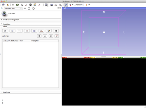
- Current GUI (as of Slicer 4.0.1)
Possible Changes
- Move the Module selector from the toolbar to the "Module panel"
- Motivations
- Saves horizontal space in the toolbar
- Visually links the module selector with the module panel
- Possibility to save some screen real estate
- By reusing the empty module panel dock title
- By moving the Slicer logo
- Allows multiple module panels open at the same time (1 module selector per module panel).
- Suggestion 1
- Motivations
- Simplify Picking toolbar
Suggestion
- Suggestion 1 as applied to the Annotation Module
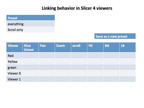
Controlling Linking
- insert into the viewer controller module.
- The module has a pull down with available presets. One of the pull down selection items is create a new preset.
- popup window with a clickable table like in the mock up.
See also Jim's analysis on the slicer wiki

