Difference between revisions of "2012 Project Week:ViewerControls"
From NAMIC Wiki
| (5 intermediate revisions by the same user not shown) | |||
| Line 1: | Line 1: | ||
__NOTOC__ | __NOTOC__ | ||
| − | <gallery> | + | <gallery widths="300px" perrow="3"> |
Image:PW-SLC2011.png|[[2012_Winter_Project_Week#Projects|Projects List]] | Image:PW-SLC2011.png|[[2012_Winter_Project_Week#Projects|Projects List]] | ||
Image:SliceController-2011-11.png|SliceController before redesign | Image:SliceController-2011-11.png|SliceController before redesign | ||
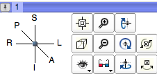
Image:3D-Viewer-Control-2011-11-23.png|3D Viewer controller before redesign | Image:3D-Viewer-Control-2011-11-23.png|3D Viewer controller before redesign | ||
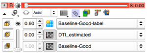
| − | Image:2012-01-MinimalistSliceController.png|Proposed initial minimalist presentation. The little triangle on the left toggles to full view. | + | Image:2012-01-MinimalistSliceController.png|'''Proposed''' initial minimalist presentation of the pop-up. Only the BG slot is displayed. The little triangle on the left toggles to full view. The triangle has a tooltip. Note the repositioned "adjust FOV" button |
| − | Image:2012-01-FullViewerController.png|Proposed full | + | Image:2012-01-FullViewerController.png|'''Proposed''' full view with the FG/BG blender slider permanently in position. The triangle is rotated. "Adjust opacity" for label maps pops up on clicking on the eye icon on that row (perhaps a different icon needed?) |
</gallery> | </gallery> | ||
| Line 35: | Line 35: | ||
<h3>Progress</h3> | <h3>Progress</h3> | ||
| − | + | *several options were discussed | |
| + | *a preliminary design change has emereged | ||
</div> | </div> | ||
Latest revision as of 12:53, 8 February 2012
Home < 2012 Project Week:ViewerControlsKey Investigators
- Kitware: Julien Finet
- SPL: Ron Kikinis, Andrey Fedorov
- Iowa: Hans Johnson
- MGH: Greg Sharp
Objective
We are redesigning the layout and behavior of the slice controller in Slicer4.
Approach, Plan
The View Controllers were completely redesigned for Slicer 4. Criteria used for this redesign were the maximization of use of screen real estate for image display and easy accessibility for the most frequently used functions. Several issues have come up during use of this new design. We will work on a redesign based on experience. Complaints with the current design are:
- the slider for mixing FB and BG is difficult to control
- control of label map transparency is difficult to achieve
- The visibility icon for FB and BG do not add functionality
Ideas:
- let each of the "eye" buttons trigger the "mix" mode of the mouse for Bg/Fg, and Label layers. Once this mode is triggered, change the mouse pointer icon, and change opacity on mouse key press + move
Progress
- several options were discussed
- a preliminary design change has emereged
Delivery Mechanism
This work will be delivered as part of Slicer 4
Notes
- currently the 't' key toggles fg opacity and the 'g' key toggles label map opacity


