Difference between revisions of "Slicer3:Interface Design and Usability"
| Line 424: | Line 424: | ||
<br /> | <br /> | ||
| − | + | ||
| Line 434: | Line 434: | ||
<br /> | <br /> | ||
| − | [[Slicer3:Interface_Design|Return to | + | [[Slicer3:Interface_Design | Return to Slicer3 Interface Design and Usability ]] |
| − | |||
| − | |||
| − | + | [[Slicer3 | Return to Slicer3 main page ]] | |
Revision as of 12:26, 9 January 2007
Home < Slicer3:Interface Design and UsabilityWorking notes: Slicer3 GUI and its application interface:
Contents
- 1 Project goals
- 2 Project reporting
- 3 User Interface Guidelines for Developers
- 3.1 First steps: How to build a Slicer3 Module GUI
- 3.2 3DSlicer application style guide
- 3.2.1 Look and Feel
- 3.2.2 Module style
- 3.2.3 Pop-up windows
- 3.2.4 Confirm on Delete
- 3.2.5 Event Bindings
- 3.2.6 Application Font
- 3.2.7 Icons
- 3.2.8 Widget-specific patterns to follow
- 3.2.9 Providing help
- 3.2.10 Popup messages (dialog, warning, error, confirm, etc.)
- 3.2.11 Language
- 3.2.12 Credit and Logos
- 3.2.13 Controls and Layout
- 3.2.14 Progress Feedback
- 3.2.15 Colors: application palette
- 4 Feature Requests, Resource Requests and Emerging Conventions
Project goals
Design and engineer Slicer3 UI. Employ a user-centered approach and establish usability guidelines.
Project reporting
The scope of this effort is sorted into four categories: Engineering, UI design, Usability and Slicer3 branding. The subtasks of each category are itemized below and specific information about each category is located on the linked pages.
UI Architecture & Engineering
Tasks: (more detailed UI Architecture & Engineering information can be found here).
- design thin GUI layer, separate from the control logic and data model;
- design a model for representing the UI and managing local events;
- extend the model for handling remote events;
- design means of mapping KWWidgets onto that model;
- set priorities with Kitware involving extensions & modifications to KWWidgets;
- determine the api to application logic, used by GUI and by scripts;
- design set of base classes that give module developers an easy pattern to follow;
- develop guidelines for slicer base developers and module developers;
- design mechanism for centrally specifying look & feel (and permitting overrides);
UI Design & Prototypes
Tasks: (more detailed UI Design & Prototype information can be found here ).
- design overall look to Slicer3 application in keeping with core values;
- design look & feel applied to developer modules;
- design KWWidgets class to specify custom widgets for Slicer main app & modules;
- implement Slicer3 Application GUI
- design conventions for specifying global and module-specific keyboard accelerators;
- specify and document global keyboard accelerators;
- iterate on prototype(s) and present them for comments and suggestions;
Usability
Tasks: (more detailed Usability information can be found here ).
- determine which Slicer3 tools will require user studies and user testing;
- develop mechanisms for user feedback on usability issues.
- interview core user community members to investigate general and domain-specific usability issues, user requirements, technical requirements.
- consolidate and report what is learned for reference and use in design process
- test designs with members of the user community, analyze testing results & iterate
- develop and publish design guidelines to support usability and software consistency.
Slicer3 Brand
Tasks: (Slicer3 brand sketches can be found here ).
- fully express Slicer3 brand: design logo, splash screen, style sheets for web presence;
User Interface Guidelines for Developers
First steps: How to build a Slicer3 Module GUI
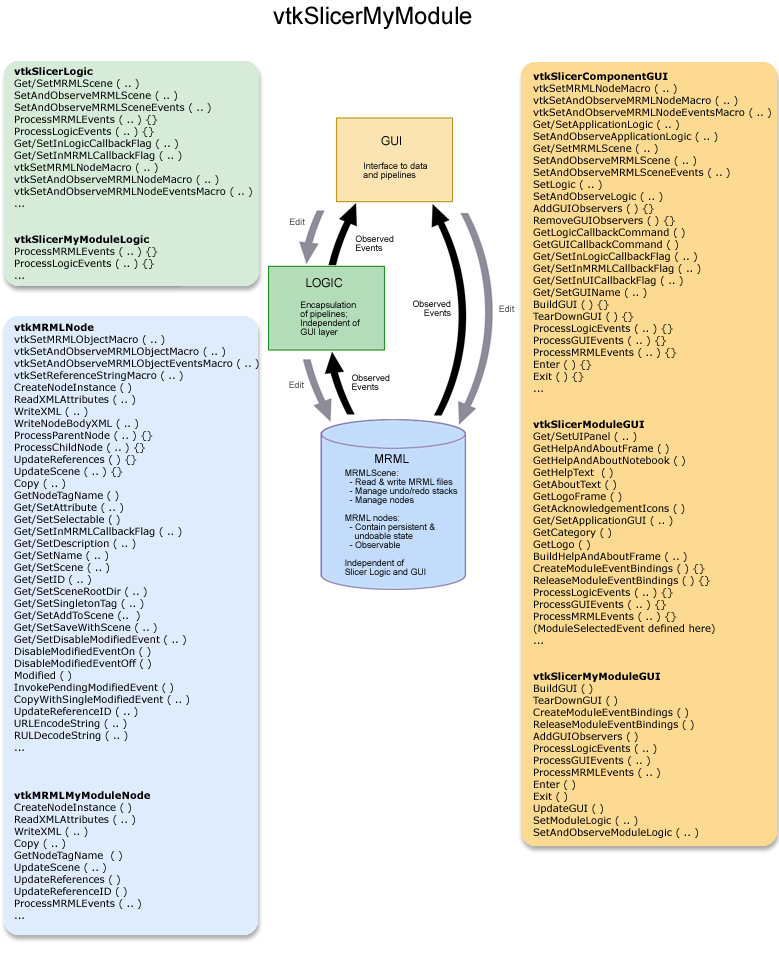
First, note that the GUI base classes may be refactored as Slicer3 develops; it's recommended that you check documentation periodically for new base class methods which may be useful. The figure below shows a current overview of the three classes a new module (called MyModule for example) will need to define (vtkSlicerMyModuleGUI, vtkSlicerMyModuleLogic and vtkMRMLMyModuleNode) and some of the methods those classes should include to utilize the Slicer3 infrastructure. These classes should reside in the slicer3/Modules/MyModule/ directory.
Deriving your GUI class: To create a Module GUI that expresses its interface in Slicer's shared UIpanel, derive your class (vtkSlicerMyModuleGUI) from vtkSlicerModuleGUI. For a Module GUI that expresses its interface in a different panel of the Main Slicer Window, or in a toplevel widget, derive vtkSlicerMyModuleGUI from vtkSlicerComponentGUI instead. Your GUI class will inherit application logic and MRML pointers, an API for setting and observing them, and a framework for defining MRML, Logic and GUI callbacks from its parent class. Specific mediator methods, other logic and MRML node pointers can be added to the module's class definition. Importantly, keep logic and MRML classes independent of the GUI to facilitate testing and command-line execution possible *without* instantiating the Slicer3 GUI.
Example: An early example to work from is the GradientAnisotropicDiffusionFilter Module; define all the widgets you need within the class and create Get Macros for each of them. Define the methods you need from vtkSlicerModuleGUI and its parent class vtkSlicerComponentGUI, including BuildGUI(); in this method, you'll first add a page to the class's UIPanel (for now, only create one page).
Two GUI styles
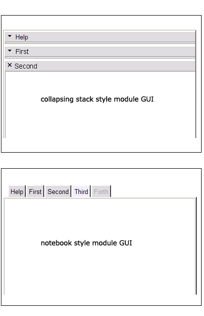
Two styles: Depending on whether you want a notebook-style GUI for your module (similar to the style used in Slicer2) or a set of stacked collapsible frames to contain different logical sections of your interface like "help" and "display", your BuildGUI() method can be written in one of two ways. The notebook style may be appropriate for modules with long logical sections within their GUI, to minimize the amount of scrolling required of a user. The collapsing style may be appropriate for modules that have numerous logical sections, since the amount of horizontal space across which a notebook would array them is limited. The way these two styles are expressed in Slicer3's GUI panel is shown below.
Collapsing style: The GradientAnisotropicDiffusionFilter Module example implements the collapsible style, first adding a single new Page in its UIPanel:
this->UIPanel->AddPage ( "MyModule", "MyModule", NULL );
then creating a vtkSlicerModuleCollapsibleFrame widget for each logical section in the GUI, parenting each to the UIPanel's single PageWidget, then creating, configuring and packing them from top to bottom in the UIPanel's PageWidget. Each logical section's widgets can be organized inside each of the vtkSlicerModuleCollapsibleFrames. The superclass has some helper methods to construct consisten Help&About Frames across modules.
 //--- help and about frame
 const char *help = "MyModule does the following...";
 const char *about = "This work was supported by...";
 vtkKWWidget *page = this->UIPanel->GetPageWidget ("MyModule");
 this->BuildHelpAndAboutFrame ( page, help, about );
 //--- rest of the frames
 vtkSlicerModuleCollapsibleFrame *firstFrame = vtkSlicerModuleCollapsibleFrame::New ( );
 vtkSlicerModuleCollapsibleFrame *secondFrame = vtkSlicerModuleCollapsibleFrame::New ( );
 vtkSlicerModuleCollapsibleFrame *thirdFrame = vtkSlicerModuleCollapsibleFrame::New ( );
 vtkSlicerModuleCollapsibleFrame *forthFrame = vtkSlicerModuleCollapsibleFrame::New ( );
 ...
 //--- parenting the frames to the same UIpanel page
 firstFrame->SetParent ( page );
 secondFrame->SetParent ( page );
 ...
 //--- parenting widgets to the various frames
 this->widget2->SetParent ( firstFrame->GetFrame () );
 this->widget3->SetParent ( secondFrame->GetFrame () );
Notebook style: To create a notebook style GUI (as there is no example yet, a little code will be included here), a new Page must be added to the UIPanel for every tab in the notebook:
 //--- get a pointer to the KWUserInterfaceManagerNotebook
 vtkKWUserInterfaceManagerNotebook *nbm = vtkKWUserInterfaceManagerNotebook::SafeDownCast ( this->UIPanel->GetUserInterfaceManager());
 //--- help and about frame
 this->UIPanel->AddPage ( "Help&About", "Information about using this module", NULL );
 const char *help = "MyModule does the following...";
 const char *about = "This work was supported by...";
 vtkKWWidget *page = this->UIPanel->GetPageWidget ("Help");
 this->BuildHelpAndAboutFrame ( page, help, about );
 //--- pages for other frames
 int page1ID = this->UIPanel->AddPage ( "First", "Functionality for some logical piece of module", NULL );
 int page2ID = this->UIPanel->AddPage ( "Second", "Functionality for another logical piece of module", NULL );
 //--- enabling or disabling notebook tabs
 nbm->GetNotebook()->SetPageEnabled ( page1ID, 1 );
 nbm->GetNotebook()->SetPageEnabled ( page2ID, 0 );
Widgets to be packed within each notebook page are parented to the PageWidget:
 this->widget2->SetParent ( this->UIPanel->GetPageWidget ( "First" ) );
 this->widget3->SetParent ( this->UIPanel->GetPageWidget ( "Second" ) );
or can be parented to a widget already parented to the PageWidget. Then they themselves can be created, configured, and packed in the same manner as they are in the GradientAnisotropicDiffusionFilter Module.
Defining methods
Methods to define: Define the methods you require from vtkSlicerComponentGUI base class, like: AddGUIObservers(), RemoveGUIObservers(), ProcessLogicEvents(), ProcessGUIEevents(), ProcessMRMLEvents(), Enter() and Exit(); and whatever else your module needs. (Eventually, available modules will be automatically detected, but this is not yet implemented; then, the Enter() method will probably be made to call the BuildGUI() method. For now, instantiate your class in Slicer3.cxx and call its BuildGUI() and other methods, following the pattern for other modules established there.)
Adding and removing observers
Adding observers: In AddGUIObservers, add an observer on each widget whose events you want to process. When an event is observed, the ProcessGUIEvents() method is called via the GUICallbackCommand; define this class to propagate information from the GUI to logic and MRML. Though it is tempting, try not to use ProcessGUIEvents() to update the GUI state directly -- just modify the Logic state, and allow observers on the logic and subsequent processing in ProcessLogicEvents() and ProcessMRMLEvents() to bring that state change BACK into the GUI.
Removing observers: In RemoveGUIObservers, make sure you remove every observer you've added to widgets in the GUI before calling Delete() on your widget. Make sure you call SetAndObserveMRML() and SetAndObserveLogic( ) with NULL pointers in your GUI class destructor to remove all observers on MRML and Logic that you have created.
Defining new widgets
Defining your own widgets: The framework for doing this is still evolving. Currently there are two types of new widgets, those defined as extensions to vtkKW (like vtkKWWindowLevelThresholdEditor.h/cxx) and those defined as Slicer-specific widgets, (like vtkSlicerSliceControlWidget.h/cxx, derived from the vtkSlicerWidget.h/cxx base class). The Slicer widgets have methods for putting observers on their widget components, Logic and MRML, and processing events as well. Thus GUI classes that instance them do not have to manage events for them if the widgets' methods are used instead.
Using Undo and Redo
Undo: Make sure you process those events that mark junctures at which MRML state should be saved for Undo/Redo (using MRML's SaveStateForUndo() method. A detailed description of how undo/redo works, and how to use it in your module is available here.
Adding the module to the rest of Slicer3
Other files you will have to touch: For now, to add your module to Slicer3, create a new instance of vtkSlicerMyModuleLogic and vtkSlicerMyModuleGUI in Applications/GUI/Slicer3.cxx, and follow the pattern used by the GradientAnisotropicDiffusionFilter module for now, until the framework is developed for Slicer3 to autodetect your module and do the right things. You should also create your own CMakeLists.txt file in your module directory and (follow the example in other Module directories), add your module to Modules/CMakeLists.txt, and to Applications/GUI/CMakeLists.txt.
Miscellaneous
Helpful tips:
- Make the vtkModuleCollapsibleFrames which contain the major logical sections of your module members of your module GUI class and expose them through your API. Doing so helps other developers, who may want to offer a jump to your module's functionality, to programmatically raise your UIpanel and expand the frame they're interested in. This paradigm will help to promote fluid navigation of slicer's interface and the reuse of existing functionality.
GUI Style: Try not to add style elements (like foreground and background color, font, relief, etc.) to the interface you create; let the options database (as set up by the vtkSlicerTheme class) specify the style for you so that all modules appear consistent within the Slicer3 application.
3DSlicer application style guide
Look and Feel
Module style
Pop-up windows
Confirm on Delete
Event Bindings
With respect to the specification of keyboard accelerators, please follow these three recommendations;
- Before assigning "hot-keys" to functionality, either in the main Slicer application or in a new module, please consult the table (and design plan) linked below to make sure the key is not already assigned.
- Across Slicer modules, try to use similar "hot-key" assignments for similar functionality; this consistency makes Slicer easier to learn.
- Once you assign "hot-keys" in your module, please add those mappings to the table for others to reference.
Event bindings planning and assignment .
Application Font
Verdana is the font chosen for the 3DSlicer brand. Maintaining consistency of type is an important component of maintaining a coherent look and feel for 3DSlicer and any related or derived visual communications. Verdana was designed specifically to be read on a digital display; it is recommended that we use Verdana (or Geneva) wherever possible in 3DSlicer's web presence and online tutorial materials, and wherever reasonable and appropriate in formal printed materials. Within the software, since it can't be guaranteed that these fonts will be widely available on all platforms, Helvetica or Arial should be used as a substitute. Slicer's theme sets the application font to be Helvetica 8 normal. Please avoid typefaces with serifs.
Icons
Widget-specific patterns to follow
Providing help
Popup messages (dialog, warning, error, confirm, etc.)
Language
Credit and Logos
Controls and Layout
Progress Feedback
Colors: application palette
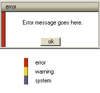
The draft slicer color palette is shown below (this palette will still evolve as the UI design evolves -- in particular to accommodate colors used in the final Slicer3 logo). Developers of code, web content and training materials are encouraged to make color choices for GUI components according to this palette, bearing in mind that some of the colors are linked with special meaning, such as error (red), warning (bright yellow), and system (mediumBlue) messages, and unsaved data in drop-down menus and selection boxes (warmMediumGrey).
| color | R | G | B | hex | use in slicer | |
|---|---|---|---|---|---|---|
| black | 0 | 0 | 0 | #000000 | ||
| white | 255 | 255 | 255 | #ffffff | GUI background | |
| darkWarmGrey | 96 | 94 | 83 | #605e53 | ||
| mediumWarmGrey | 139 | 136 | 120 | #8b8878 | unsaved data ? | |
| lightWarmGrey | 205 | 200 | 177 | #cdc8b1 | ||
| warmGreyTint | 238 | 232 | 220 | #eee8dc | ||
| darkOrange | 196 | 74 | 26 | #c44a1a | ||
| brightOrange | 224 | 111 | 19 | #e06f13 | ||
| brightYellow | 231 | 209 | 62 | #e7d13e | warning message code | |
| yellowTint | 238 | 214 | 128 | #eed680 | sag slice | |
| darkCocoa | 130 | 102 | 71 | #826647 | ||
| lightCocoa | 179 | 145 | 105 | #b39169 | ||
| stone | 224 | 195 | 158 | #e0c39e | ||
| stoneTint | 239 | 224 | 205 | #efe0cd | ||
| red | 195 | 46 | 15 | #c32e10 | error message code | |
| brick | 186 | 70 | 43 | #ba462b | ||
| lightBrick | 193 | 115 | 80 | #c17350 | axi slice | |
| redTint | 224 | 182 | 175 | #e0b6af | ||
| darkGreen | 68 | 86 | 50 | #445632 | ||
| brightGreen | 104 | 143 | 66 | #688f42 | ||
| dustyGreen | 138 | 165 | 111 | #8aa56f | cor slice | |
| greenTint | 204 | 244 | 166 | #ccf4a6 | ||
| darkBlue | 73 | 64 | 102 | #494066 | ||
| mediumBlue | 98 | 91 | 129 | #625b81 | system message code | |
| lightBlue | 136 | 127 | 163 | #887fa3 | unsaved data? | |
| slicerBlue | 179 | 179 | 230 | #b3b3e6 |
This prototype dialog box is an example of Slicer3's limited use of color coding:
Feature Requests, Resource Requests and Emerging Conventions
We are collecting feature, conventions and resource requests from users and developers. Appropriate entries from Slicer2's bug tracker will be periodically added to this repository also.


