Difference between revisions of "2012 Project Week:GeneralGUI"
From NAMIC Wiki
m (Text replacement - "http://www.slicer.org/slicerWiki/index.php/" to "https://www.slicer.org/wiki/") |
|||
| Line 33: | Line 33: | ||
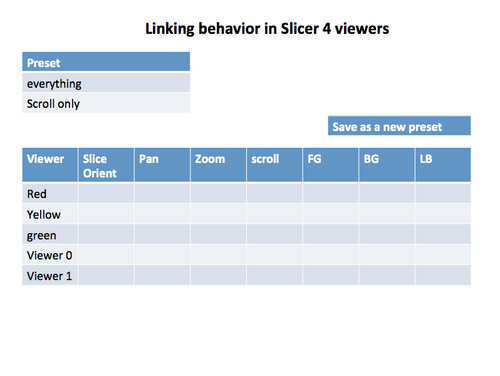
[[image:2012-01-10-Linking.png|500px|Mock up of a panel to modify linking behavior]] | [[image:2012-01-10-Linking.png|500px|Mock up of a panel to modify linking behavior]] | ||
| − | See also Jim's [ | + | See also Jim's [https://www.slicer.org/wiki/Slicer3:UIDesign:WorkingProblems:LinkedControls analysis on the slicer wiki] |
Latest revision as of 17:41, 10 July 2017
Home < 2012 Project Week:GeneralGUICurrent GUI
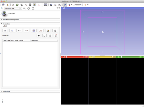
- Current GUI (as of Slicer 4.0.1)
Possible Changes
- Move the Module selector from the toolbar to the "Module panel"
- Motivations
- Saves horizontal space in the toolbar
- Visually links the module selector with the module panel
- Possibility to save some screen real estate
- By reusing the empty module panel dock title
- By moving the Slicer logo
- Allows multiple module panels open at the same time (1 module selector per module panel).
- Suggestion 1
- Motivations
- Simplify Picking toolbar
Suggestion
- Suggestion 1 as applied to the Annotation Module
Controlling Linking
- insert into the viewer controller module.
- The module has a pull down with available presets. One of the pull down selection items is create a new preset.
- popup window with a clickable table like in the mock up.
See also Jim's analysis on the slicer wiki

