Difference between revisions of "Slicer3:EditorUsabilitySessions"
| Line 118: | Line 118: | ||
|- bgcolor="#ffffff" | |- bgcolor="#ffffff" | ||
! icon | ! icon | ||
| + | ! tool / function | ||
! hot-key | ! hot-key | ||
! actions taken upon tool-selection | ! actions taken upon tool-selection | ||
| Line 124: | Line 125: | ||
|- | |- | ||
| [[Image:SnaptoGridOn.png]] | | [[Image:SnaptoGridOn.png]] | ||
| + | | Snap to grid on | ||
| .. | | .. | ||
| .. | | .. | ||
| Line 130: | Line 132: | ||
|- | |- | ||
| [[Image:SnapToGridOff.png]] | | [[Image:SnapToGridOff.png]] | ||
| + | | Snap to grid off | ||
| .. | | .. | ||
| .. | | .. | ||
| Line 136: | Line 139: | ||
|- | |- | ||
| [[Image:ChooseColor.png]] | | [[Image:ChooseColor.png]] | ||
| + | | | ||
| .. | | .. | ||
| .. | | .. | ||
| Line 142: | Line 146: | ||
|- | |- | ||
| [[Image:SlurpColor.png]] | | [[Image:SlurpColor.png]] | ||
| + | | | ||
| .. | | .. | ||
| .. | | .. | ||
| Line 148: | Line 153: | ||
|- | |- | ||
| [[Image:SetROIOpacity.png]] | | [[Image:SetROIOpacity.png]] | ||
| + | | | ||
| .. | | .. | ||
| .. | | .. | ||
| Line 154: | Line 160: | ||
|- | |- | ||
| [[Image:PaintLabel.png]] | | [[Image:PaintLabel.png]] | ||
| + | | | ||
| .. | | .. | ||
| .. | | .. | ||
| Line 160: | Line 167: | ||
|- | |- | ||
| [[Image:ChooseBrushSize.png]] | | [[Image:ChooseBrushSize.png]] | ||
| + | | | ||
| .. | | .. | ||
| .. | | .. | ||
| Line 166: | Line 174: | ||
|- | |- | ||
| [[Image:EraseLabel.png]] | | [[Image:EraseLabel.png]] | ||
| + | | | ||
| .. | | .. | ||
| .. | | .. | ||
| Line 172: | Line 181: | ||
|- | |- | ||
| [[Image:ConvertROI2Label.png]] | | [[Image:ConvertROI2Label.png]] | ||
| + | | | ||
| .. | | .. | ||
| .. | | .. | ||
| Line 178: | Line 188: | ||
|- | |- | ||
| [[Image:ImplicitEllipseROI.png]] | | [[Image:ImplicitEllipseROI.png]] | ||
| + | | | ||
| .. | | .. | ||
| .. | | .. | ||
| Line 184: | Line 195: | ||
|- | |- | ||
| [[Image:ImplicitRectangleROI.png]] | | [[Image:ImplicitRectangleROI.png]] | ||
| + | | | ||
| .. | | .. | ||
| .. | | .. | ||
| Line 190: | Line 202: | ||
|- | |- | ||
| [[Image:ImplicitSphereROI.png]] | | [[Image:ImplicitSphereROI.png]] | ||
| + | | | ||
| .. | | .. | ||
| .. | | .. | ||
| Line 196: | Line 209: | ||
|- | |- | ||
| [[Image:ImplicitCubeROI.png]] | | [[Image:ImplicitCubeROI.png]] | ||
| + | | | ||
| .. | | .. | ||
| .. | | .. | ||
| Line 202: | Line 216: | ||
|- | |- | ||
| [[Image:DrawFreePolylineROI.png]] | | [[Image:DrawFreePolylineROI.png]] | ||
| + | | | ||
| .. | | .. | ||
| .. | | .. | ||
| Line 208: | Line 223: | ||
|- | |- | ||
| [[Image:DrawFreePolylineAnnularROI.png]] | | [[Image:DrawFreePolylineAnnularROI.png]] | ||
| + | | | ||
| .. | | .. | ||
| .. | | .. | ||
| Line 214: | Line 230: | ||
|- | |- | ||
| [[Image:RedrawFreePolylineROI.png]] | | [[Image:RedrawFreePolylineROI.png]] | ||
| + | | | ||
| .. | | .. | ||
| .. | | .. | ||
| Line 220: | Line 237: | ||
|- | |- | ||
| [[Image:DrawExplicitPolylineROI.png]] | | [[Image:DrawExplicitPolylineROI.png]] | ||
| + | | | ||
| .. | | .. | ||
| .. | | .. | ||
| Line 226: | Line 244: | ||
|- | |- | ||
| [[Image:DrawExplicitPolylineAnnularROI.png]] | | [[Image:DrawExplicitPolylineAnnularROI.png]] | ||
| + | | | ||
| .. | | .. | ||
| .. | | .. | ||
| Line 232: | Line 251: | ||
|- | |- | ||
| [[Image:AddPositionVertex.png]] | | [[Image:AddPositionVertex.png]] | ||
| + | | | ||
| .. | | .. | ||
| .. | | .. | ||
| Line 238: | Line 258: | ||
|- | |- | ||
| [[Image:MoveVertex.png]] | | [[Image:MoveVertex.png]] | ||
| + | | | ||
| .. | | .. | ||
| .. | | .. | ||
| Line 244: | Line 265: | ||
|- | |- | ||
| [[Image:SelectVertex.png]] | | [[Image:SelectVertex.png]] | ||
| + | | | ||
| .. | | .. | ||
| .. | | .. | ||
| Line 250: | Line 272: | ||
|- | |- | ||
| [[Image:SelectROI.png]] | | [[Image:SelectROI.png]] | ||
| + | | | ||
| .. | | .. | ||
| .. | | .. | ||
| Line 256: | Line 279: | ||
|- | |- | ||
| [[Image:Deselect.png]] | | [[Image:Deselect.png]] | ||
| + | | | ||
| .. | | .. | ||
| .. | | .. | ||
| Line 262: | Line 286: | ||
|- | |- | ||
| [[Image:CopyROI.png]] | | [[Image:CopyROI.png]] | ||
| + | | | ||
| .. | | .. | ||
| .. | | .. | ||
| Line 268: | Line 293: | ||
|- | |- | ||
| [[Image:PasteROI.png]] | | [[Image:PasteROI.png]] | ||
| + | | | ||
| .. | | .. | ||
| .. | | .. | ||
| Line 274: | Line 300: | ||
|- | |- | ||
| [[Image:Delete.png]] | | [[Image:Delete.png]] | ||
| + | | | ||
| .. | | .. | ||
| .. | | .. | ||
| Line 280: | Line 307: | ||
|- | |- | ||
| [[Image:DilateROI.png]] | | [[Image:DilateROI.png]] | ||
| + | | | ||
| .. | | .. | ||
| .. | | .. | ||
| Line 286: | Line 314: | ||
|- | |- | ||
| [[Image:ErodeROI.png]] | | [[Image:ErodeROI.png]] | ||
| + | | | ||
| .. | | .. | ||
| .. | | .. | ||
| Line 292: | Line 321: | ||
|- | |- | ||
| [[Image:UnionROI.png]] | | [[Image:UnionROI.png]] | ||
| + | | | ||
| .. | | .. | ||
| .. | | .. | ||
| Line 298: | Line 328: | ||
|- | |- | ||
| [[Image:TrimROI.png]] | | [[Image:TrimROI.png]] | ||
| + | | | ||
| .. | | .. | ||
| .. | | .. | ||
| Line 304: | Line 335: | ||
|- | |- | ||
| [[Image:InterpolateROIs.png]] | | [[Image:InterpolateROIs.png]] | ||
| + | | | ||
| .. | | .. | ||
| .. | | .. | ||
| Line 310: | Line 342: | ||
|- | |- | ||
| [[Image:MakeModel.png]] | | [[Image:MakeModel.png]] | ||
| + | | | ||
| .. | | .. | ||
| .. | | .. | ||
| Line 316: | Line 349: | ||
|- | |- | ||
| [[Image:GoToEditor.png]] | | [[Image:GoToEditor.png]] | ||
| + | | | ||
| .. | | .. | ||
| .. | | .. | ||
| Line 322: | Line 356: | ||
|- | |- | ||
| [[Image:PinOpen.png]] | | [[Image:PinOpen.png]] | ||
| + | | | ||
| .. | | .. | ||
| .. | | .. | ||
| Line 328: | Line 363: | ||
|- | |- | ||
| [[Image:Close.png]] | | [[Image:Close.png]] | ||
| + | | | ||
| .. | | .. | ||
| .. | | .. | ||
Revision as of 11:23, 29 June 2007
Home < Slicer3:EditorUsabilitySessions<< Back to 3DSlicer Usability page
Contents
- 1 User feedback for design of the Editor Module
- 1.1 General:
- 1.2 Region drawing:
- 1.3 Label map editing:
- 1.4 Label map saving:
- 1.5 From label maps to models:
- 1.6 Schematics illustrating some challenges in existing editor:
- 1.7 Editor design sketch 1:
- 1.8 Editor design sketch 2:
- 1.9 Editor design sketch 3:
- 1.10 Questions and Feedback on editor design sketches:
User feedback for design of the Editor Module
General:
- In Slicer2 workflow, “apply” is currently being used as a “preview” and “undo” is used to back out of an unsatisfactory operation. In Slicer3, instead of “apply” and “undo”, we should consistently implement “preview”, and “apply”. Though these may be implement the same operations programmatically, the concept of preview has less implicit stress for the user, who won’t worry that their original data may become unrecoverable.
- Visual cue: Should we assign a reserved color or visual appearance for ‘Editor preview’ so that in complicated visualizations, it will be clear which regions are being affected by the operation in preview?
- Provide multiple undo and redo as well.
- Inside editor module, users agree that having the hidden slice controller (which reappears on mouse-over) is very useful. However, sometimes while scrolling thru slices using the slice controller’s scale, the mouse travels off the controller bringing focus back to the slice window by mistake, and resulting in unintended drawing in that slice. This is very frustrating and requires time to clean up. We need to consider a workaround that
- Editing is done in all orientations, but the original acquisition plane is used, when possible, to make challenging decisions. Feature request: Might be good to visually indicate which of the slice viewers is displaying slices in the plane of acquisition.
- Nobody we spoke to is using the Draw2 module, though having a simple spline tool in addition to points, lines and polygons to draw regions would be nice.
- Within the editor, it would be nice to have a single location in which a user can: ask for a statistics/metrics report (including intensity min, max, mean, std.dev., and volume) for a single region or for all defined regions, and to have the option to save this information out to a text-file. Currently, MeasureVol module will give volume measurements for all labels (user can’t select a single one) and writes a text file; and Editor->Details Drawmode has the intensity statistics, no volume measurements, and no ability to write the text file.
- Existing hot-keys: Strong recommendation not to remap. Very efficient keyboard operations are used by everyone we spoke with: left hand using index and ring fingers on right and left arrows to move between slices, middle finger on up arrow to apply a point, and on shift key to view in all slice planes simultaneously; right hand moves the mouse to specify point location. Remapping the up and down arrows to also move between slices would strongly impact what has become very natural and efficient keyboard drawing.
Region drawing:
- Might be useful in some cases to have coarse region-specification tools like rectangle, circle, oval.
- Absolutely need to be able to draw polygons that may, under some circumstances be self-intersecting.
- “Outline labelmap” should be off by default, not on. This feature is only infrequently used by this group in a pathological way, to approximate the viewing of two labelmaps at once (one in Foreground, and a different one outlined in the label map layer).
- Strong agreement among all users: Need multiple undo and multiple redo commands for drawing.
- When drawing regions, PNL doesn’t much use the magnifier window in Slicer2’s lower left panel. Instead, users often zoom in and out repeatedly in the slice plane in which they’re working. Feature request: In this context, a simple interface that remembers the current working zoom-factor, and lets a user zoom in, out and snap back in one click or with hot-keys (Ctrl+, Ctrl-, Ctrl0?) could be useful (and save a lot of mouse click-and-drag time).
- One strategy for specifying an ROI is to identify first and last plane in which the region must be drawn, to draw these, then outline in the middle slice plane, then fill in all slices between. Feature request: Might be handy to have a simple interface for setting and clearing “keyframes” which bracket a ROI, or snap the slice viewer to slices that contain anatomical markers.
- When drawing a region, if points or vertices on lines, polygons are wrong, instead of deleting and starting over, users select offending points or vertices and move them. Good ways to select and move points
- Selecting points or vertices: might be useful to have lasso or rubber band tool to select points or vertices, rather than having to individually click on them.
- In Editor->Effects Draw: Draw/Select/Move modes are good. May want to modernize some of the drawing and painting tools and exploit common paint software conventions: How about: Path editing section on GUI that includes tools for outlining a path with pencil (points), with lines (vertices), or polygon (vertices), and using a paintbucket fill? Plus the options to select points/vertices, move them or delete them. Then a painting section on the GUI that lets user choose brush tool, set brush-size, shape and brush-mode (Threshold paint is an idea that raised a lot of excitement). We should mock this up. Offer all current functionality, just modernized, and a few more tools.
- Feature request: a tool to report the length of a curved line drawn in the Editor (used for instance, to measure length of curvature lines drawn along sulci).
- One concern is with making principled sub-voxel decisions, and designing tools that assist that decision. Worth thinking about this issue more deeply.
- Tools to assist in region drawing: in a very zoomed-in view in the slices windows, it might be nice to see the intensity values of each voxel as annotations on the voxels – often decisions about whether to include a voxel or not are based on an intensity range, and having this information at hand might make such decisions faster and less error-prone.
- Having the ability to quickly toggle interpolation might also assist in voxel inclusion decisions.
- Having a hot-key or icon/hot-key to toggle crosshairs in the slice viewers would be useful; the crosshairs are often used to most clearly inspect an individual voxel in all slice views.
Label map editing:
- Average time per case: Editing a label map (such as output from EMSegmenter) takes between 20 minutes and an hour per case.
- Edited label maps are most often saved as new label maps; so that data remains from each step in the process.
- Ability to use "threshold" on existing labelmaps (for instance to remove all below 53 and all above 81). Clarification: does this mean remove all labels in a selected label map with ID below 53 and above 81?
- Strong agreement among all users: Need multiple undo and multiple redo commands for editing.
- Strong agreement among all users: We need the ability to simultaneously overlay and composite multiple label maps over a single grayscale image.
- Ability to edit a single label map while viewing several label maps simultaneously.
- Ability to apply an editing operation to multiple label maps at once.
- Context: Island removal: When editing a label map (such as output of EMSegmenter), often scan thru the entire label volume, find the minimum size of an island user wants to keep, and then sets the island removal size to ensure it remains, but that smaller ones will be removed. User applies the operation and scans thru volume to ensure nothing valuable was filled. If results are not good, undo is used to restore to previous state. Recommendation: would be nice to get a preview that visibly demarcates all islands that will be removed under the current island size threshold, so a user can scan through the map and make sure it looks good before applying.
- Behavior of remove island, under the “Scope” and “Native” and “Active” configurations is not clear to everyone (people have different interpretations of how this might behave, no tooltips on “Native” and “Active”, and help text is incomplete).
- Automatic save island: Remove island can be configured to move automatically from slice to slice. Save island must be applied manually for each slice. Can this have an automatic mode as well?
- Possibility to draw a label in multiple slices at once.
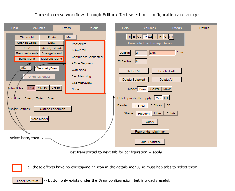
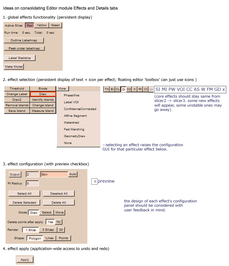
- Rethink the behavior of the various options in Editor->Effects and Editor->Details: In Editor->Effects, for all a user selects an effect, and then is transported to the Editor->Details to configure and apply the effect. Editor->Details panel also contains icons for all effects, but not for “measure island”, “save island” and other effects in the “more” pull-down menu. Must go back to the Editor->Effects panel to choose these effects. Recommendations: make behavior consistent and include icons for “measure island” and “save island” in the Editor->Details panel; perhaps collapse Editor->Effects and Editor->Details into a single panel and eliminate panel-jumping altogether. Editor sketches that illustrate the current coarse module navigation in Slicer2 and ideas on redesign are shown at the end of this section. Feedback on these is encouraged: might this simplify workflow? Will this possibly cause any unintended obvious problems? What can we do to modify and refine these?
- Editor toolbox popup menu: The same icons presented in the Editor GUI panel for all editor effects could be presented in a small floating “editor toolbox” panel. This floating GUI panel could control the main Editor GUI panel just as its icons do, but by being positioned closer to the slice being edited can save mouse-travel time.
- When editing a label map and changing a voxel from one label to another: Functionality to switch between different label-colors quicker, (e.g. Charlie suggests that, like in paint, switch label-colors using a hot-key: if you're drawing a labelmap in 11, you could also edit in 0 by holding down CTRL.) Or, hot-key or mouse click could bring up floating color palette with eye-dropper: users selects new label color by selecting it from palette, then palette disappears on mouse-out.
- Threshold or threshold-paint. It would be nice to be able to preview the regions of an image that will be affected by the thresholding operation as intensity range is adjusted.
- Propagation Tool (feature suggestion): Ability to propagate a drawn line (e.g. drawn on a 3D surface) medially to the gray/white interface. The result would be a surface that separates different regions of the cortex. These surfaces, the cortex surface and the interface between white and grey matter would outline an ROI. In a matter of moments, then, you could have outlined and rendered an entire ROI for one side. Request: can users describe this in more detail?
- Cortical drawing tool (3D drawing tool): In order to make drawing significantly faster, particularly for ROI which are complicated, it would be very helpful to be able to draw ROI on the 3D cortical surface where they are often clearest.
- When using the VolumeMath module to edit one label map with another, a clear description of what each math operation does should be provided
- When adding two label maps together in the VolumeMath module, regions in both maps which overlap will be assigned a new color (which may be difficult to visually notice in a complicated display) which will require an additional editing step. In that step, areas of overlap will need to be assigned to one of the two overlapping regions. In the case of label map volume math, it might be useful to make these double-assigned regions very visually conspicuous to avoid errors – perhaps by allowing a user to explicitly choose a unique label for all overlapping regions.
Label map saving:
- Option to save a labelmap but keep the former version in the MRML tree. (Detailed explanation: "when you edit a labelmap, then save it under a different name, you have to add the edited labelmap separately to the "data" table before you can see it in the drop-down menus (e.g. for the various modules, or to change the active labelmap in different views). Is there a way to automatically add the renamed labelmap to the data table?" Suggestion: May be good to have option to create a new label map (newLM) as a copy of an existing loaded label map (origLM), and then edit newLM. Then, both of these label maps should be represented in the scene.
From label maps to models:
- "model editor": update the model automatically when the corresponding labels change instead of re-creating models. In the current workflow to generate acceptable models, the user must repeatedly modify label maps, create the models, modify labels, delete and re-create models, and so on. Would be nice to simplify this workflow.
- Modelmaker: would be nice to have the option of creating models whose polygons follow exactly the faces of the voxels used to create them so no additional smoothing is added to the label mapped representation. (Doug)
Schematics illustrating some challenges in existing editor:
challenges with existing design: The schematic below illustrates how all effects are not available to be selected/configured on the Editor->Details GUI panel, and how users must hop between the two panels to select, configure, and apply these effects.
The sketch below suggests consolidating the Editor->Effects and Editor->Details panel into one, so that effect selection, configuration and apply are all available in one location. The sketch also includes the idea of replacing apply-undo with preview-apply in the workflow, and tries to identify functionality that should be persistently displayed for all editor effects (rather than re-displaying in multiple configuration panels).
Editor design sketch 1:
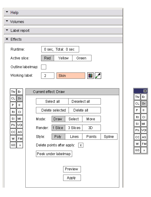
Based on the above sketch, here's a first draft of an editor module redesign, using the Draw effect as an example. Effects palette has been replaced with icons (these are stand-ins for now). Possible pop-up editor toolbox and color selection palettes are also shown to the side. This is meant to be used as fodder for discussion with users and developers. The sketch tries to maintain similarity to the Slicer2 GUI to maximize the transfer of skills to the new package -- but there will be changes; we should discuss these. Some relevant questions:
- what works and doesn't work in this layout
- are there changes that can streamline ROI drawing and editing more?
- notice that there's a "P" for Paint added to the tool palette -- other things to add, consolidate, or remove (like Dr2?)
- in the example, I've added a spline drawing style to the palette.
- no rubberband or lasso tools are present for selection -- but this mayy be useful
- is it ok for "label statistics" to go in separate section? (might let user pick all labels or one label; select output to text file and name file; and report voxel value max, min, mean, std. dev., volume)
- note: the editor icons are placeholders -- would be nice to design image icons in the palette if possible.
- ...
Editor design sketch 2:
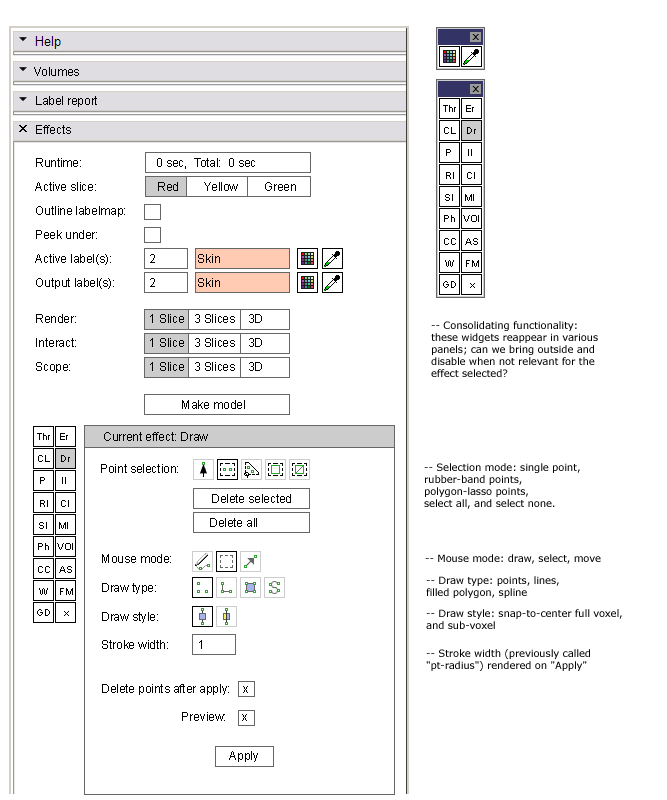
Revised sketch that incorporates some additional points from user-session (in progress):
- addressing the 'select mode' (rubber box, lasso, pick)
- ability to keep points and lines visible (lines drawn one-pixel wide and in some reserved non-label color, and points drawn in some stylized way like 1voxel x 1 voxel square outlines) until deleted?
- should there by two separate polygon and filled-polygon modes (is this ever useful?)
- integrating a "sub-voxel" draw mode, making its behavior visually distinct from the usual snap-to-vox-center-and-include draw mode.
- thinking about how "preview-and-apply" might work: Assume that the preview box is checked by default. Preview shows the line and point representation (should it also show a preview of the final stroke and fill in the label color before "Apply" is clicked?). The stroke and fill (if appropriate) are "officially" generated when "Apply" is clicked, but should be undoable.
- Render, Interact, and Scope: are these used consistently across Effects panels? Various of these widgets appear in several Effects panels, so does it make sense to bring them out into the persistent top part of the GUI panel -- and just disable them (grey them out) for Effects for which they're not relevant?
- Also, "active label" or "working label" or "output label" appear frequently in different effects panels. Can we consolidate the functionality they offer across effects and bring them out to the persistent part of the GUI? Below is undoubtedly wrong, but serves as a placeholder.
- Note: floating tool palette brought up with "Editor toolbox" toolbar icon, and floating color select/pick palette brought up by Editor-bound hotkey.
We also will need to list out a set of hot-keys that everyone agrees upon.
Editor design sketch 3:
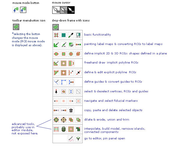
Sketch of the way a subset of ROI-definition-and-editing tools are exposed application-wide in Slicer3, with a jump-button to the editor module. The Editor module will contain a superset of that functionality.
Interface
Interface is shown below, along with toolbar icon that displays it, and mouse-mode button that indicates active mode when any of the tools are selected.
Interaction
Questions and Feedback on editor design sketches:
- Ok to bring the label statistics/metrics into a separate "Label report" panel in the Editor module? (easy to find)
- The "runtime report" -- do you need a "start/stop" timer on here? How do you use this?
- Not sure yet how to consolidate functionality across "working label, output label, and Render, Interact and Scope" (We can think about how to do this together) -- Does it make sense to you to have something like this as an Editor-wide specification (with widgets disabled when they're not relevant to a particular editor effect) or would you prefer to have the selector inside each Effects panel.
- Are the icons understandable?
- Anything obviously or subtly impacting region drawing workflow that we should fix/improve?
