|
|
| Line 19: |
Line 19: |
| | | | |
| | | | |
| − | === Two GUI styles ===
| |
| − | '''Two styles:''' Depending on whether you want a notebook-style GUI for your module (similar to the style used in Slicer2) or a set of stacked collapsible frames to contain different logical sections of your interface like "help" and "display", your BuildGUI() method can be written in one of two ways. The '''notebook style''' may be appropriate for modules with long logical sections within their GUI, to minimize the amount of scrolling required of a user. The '''collapsing style''' may be appropriate for modules that have numerous logical sections, since the amount of horizontal space across which a notebook would array them is limited. The way these two styles are expressed in Slicer3's GUI panel is shown below.
| |
| − |
| |
| − | [[Image:S3ModuleStyles.png]]
| |
| − |
| |
| − | '''''Collapsing style:''''' The GradientAnisotropicDiffusionFilter Module example implements the collapsible style, first adding a single new Page in its UIPanel:
| |
| − |
| |
| − | this->UIPanel->AddPage ( "MyModule", "MyModule", NULL );
| |
| − |
| |
| − | then creating a vtkSlicerModuleCollapsibleFrame widget for each logical section in the GUI, parenting each to the UIPanel's single PageWidget, then creating, configuring and packing them from top to bottom in the UIPanel's PageWidget. Each logical section's widgets can be organized inside each of the vtkSlicerModuleCollapsibleFrames. The superclass has some helper methods to construct consisten Help&About Frames across modules.
| |
| − |
| |
| − | //--- help and about frame
| |
| − | const char *help = "MyModule does the following...";
| |
| − | const char *about = "This work was supported by...";
| |
| − | vtkKWWidget *page = this->UIPanel->GetPageWidget ("MyModule");
| |
| − | this->BuildHelpAndAboutFrame ( page, help, about );
| |
| − |
| |
| − | //--- rest of the frames
| |
| − | vtkSlicerModuleCollapsibleFrame *firstFrame = vtkSlicerModuleCollapsibleFrame::New ( );
| |
| − | vtkSlicerModuleCollapsibleFrame *secondFrame = vtkSlicerModuleCollapsibleFrame::New ( );
| |
| − | vtkSlicerModuleCollapsibleFrame *thirdFrame = vtkSlicerModuleCollapsibleFrame::New ( );
| |
| − | vtkSlicerModuleCollapsibleFrame *forthFrame = vtkSlicerModuleCollapsibleFrame::New ( );
| |
| − | ...
| |
| − | //--- parenting the frames to the same UIpanel page
| |
| − | firstFrame->SetParent ( page );
| |
| − | secondFrame->SetParent ( page );
| |
| − | ...
| |
| − | //--- parenting widgets to the various frames
| |
| − | this->widget2->SetParent ( firstFrame->GetFrame () );
| |
| − | this->widget3->SetParent ( secondFrame->GetFrame () );
| |
| − |
| |
| − | '''''Notebook style:''''' To create a notebook style GUI (as there is no example yet, a little code will be included here), a new Page must be added to the UIPanel for every tab in the notebook:
| |
| − |
| |
| − | //--- get a pointer to the KWUserInterfaceManagerNotebook
| |
| − | vtkKWUserInterfaceManagerNotebook *nbm = vtkKWUserInterfaceManagerNotebook::SafeDownCast ( this->UIPanel->GetUserInterfaceManager());
| |
| − | //--- help and about frame
| |
| − | this->UIPanel->AddPage ( "Help&About", "Information about using this module", NULL );
| |
| − | const char *help = "MyModule does the following...";
| |
| − | const char *about = "This work was supported by...";
| |
| − | vtkKWWidget *page = this->UIPanel->GetPageWidget ("Help");
| |
| − | this->BuildHelpAndAboutFrame ( page, help, about );
| |
| − |
| |
| − | //--- pages for other frames
| |
| − | int page1ID = this->UIPanel->AddPage ( "First", "Functionality for some logical piece of module", NULL );
| |
| − | int page2ID = this->UIPanel->AddPage ( "Second", "Functionality for another logical piece of module", NULL );
| |
| − |
| |
| − | //--- enabling or disabling notebook tabs
| |
| − | nbm->GetNotebook()->SetPageEnabled ( page1ID, 1 );
| |
| − | nbm->GetNotebook()->SetPageEnabled ( page2ID, 0 );
| |
| − |
| |
| − | Widgets to be packed within each notebook page are parented to the PageWidget:
| |
| − |
| |
| − | this->widget2->SetParent ( this->UIPanel->GetPageWidget ( "First" ) );
| |
| − | this->widget3->SetParent ( this->UIPanel->GetPageWidget ( "Second" ) );
| |
| − |
| |
| − | or can be parented to a widget already parented to the PageWidget. Then they themselves can be created, configured, and packed in the same manner as they are in the GradientAnisotropicDiffusionFilter Module.
| |
| | | | |
| | | | |
Return to Slicer3 Interface Design and Usability
Slicer3 GUI layer architecture and engineering
GUI architecture and interface to application layer
Our goal is to create a thin GUI layer for Slicer3 whose architecture allows the flexible expression of interfaces that are appropriate for Slicer’s different use scenarios: an end-user application graphical user interface; script-driven batch processing and unit testing; and command-line style interaction for launching pipeline/grid processing, debugging during development, etc.
Slicer2's GUI code is quite dense, mixed in with application control logic and data model. There is no way to separate the gui from the rest of the Slicer2 application which limits the ability to perform automated tests of modules and makes development and maintenance of software more challenging. To meet our goal, the Slicer3 architecture requires a thoughtful translation of existing Slicer2 modules' functionality, and won't be as simple as dropping in a new set of widgets. The aim is to provide a framework that makes this task as easy as possible for Slicer developers while separating the Slicer3 GUI code from the application layer.
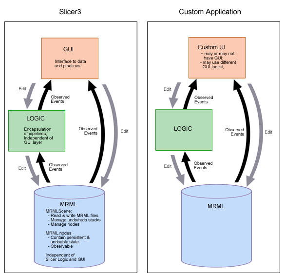
The schematic below shows the Slicer3 GUI layer design and its interface with the application layer (which includes the logic layer and the data model as shown). The design isolates the application layers from GUI code, allowing them to be invoked by the Slicer3 desktop application and GUI (Slicer3), or a custom application with or without a graphical user interface, or which may use a completely different GUI toolkit.

User input to the GUI layer modifies parameters in the MRML scene and Logic classes, and updates and executes pipelines. So that the GUI can accurately reflect application state, it maintains observers on the MRML scene, MRML nodes, and Logic objects; when the application state encapsulated in the parameters of those objects changes, events are generated, then observed and processed by the GUI to update its widgets' transient state (like entry widgets or scale values, and rendered image output).
The GUI's visual style is being designed to reflect Slicer3 brand. Developers are encouraged to adhere to style guidelines to maintain a consistent look and feel across core and custom modules and to make Slicer3 easier to learn. The style is defined and described by the Tk Options Database configured by a Slicer3 class (vtkSlicerTheme.h/cxx). These options can be overridden in an module's GUI, if a developer finds this necessary, by redefining new Tk options for widgets defined there.
Current status and TO-DO
The existing base classes form a basic framework for the UI. For the Alpha deadline, we provided a main application window with the general layout described in our current design. For the Beta deadline, we are focusing on:
- clean up vtkDebug Leaks
- copyright existing icons and logo
- working on improving the Theme to enhance module GUI appearance and readability,
- implementing functionality for view control widgets,
- implementing lightbox viewer
Return to TOC
Return to Slicer3 Interface Design and Usability
