Slicer3:Slicer3Brand
Return to Slicer3 Interface Design and Usability
Contents
Core values
This is a working list of the core values the interface and interaction should reflect/support (please refine). These are not "specifications", but rather, think of them as concepts that our user communities would value highly and which would effectively and honestly distinguish the software. These are the concepts we'd like Slicer3 to strongly project:
- Simplicity
- Clarity
- Control & Precision
- Information-rich
- Open source & cross-platform
- Furthering scientific research
- Assisting treatment/therapy
- Advanced research showcase
- Easily extensible
- Interactive & responsive
- Reliable
- Longterm viability
Slicer3 brand
A new brand for Slicer3 that projects these core values will consist of:
- New slicer logo
- Color palette and font specification
- Usage rules
- EPS description of color and monochromatic versions of the logo
- Favicon version of the color logo
This document serves as a wiki sketchbook that keeps a record of the developing design. Comments are welcome!
Evolving logo sketches
Series one
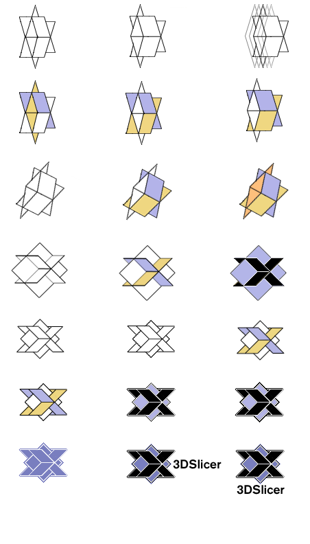
Early sketches for a new slicer logo are included below; some quick experiments. Comments about this initial set of experiments: "3D" looks too much like "ED" on the filled text especially; the vertical lines look too much like barcodes; the presence of some organic shape might be nice; and the perspective slices look a little jaggy and scary, especially when combined with "slicer".
Other comments that came out of a discussion of these sketches at the Slicer3 project meeting on 4/3/06:
- It's important to invoke some sense of our existing Slicer logo in the new Slicer logo.
- Ron favors the top right version including its color scheme out from among the sketches below. Issues: the unclosed square fails to strongly convey the sense of three-dimensionality, and the font in this (and other similar versions) sketch feel a little retro; this deviates from the core values our brand should convey.
- Need to make sure the logo can keep its integrity across many different physical scales, the smallest version might be included in a web browser's navigation tool bar.
Series two
In response to comments above, here are some new experiments toward a Slicer3 logo. To help convey a visual relationship to the Slicer2 logo, the rotated coordinate frame and slice planes were used as a launch point for these experiments. The detailed pictorial (brain) images included in the logo are not recommended for use in the new version; this kind of detail doesn't scale well in general and also strongly constrains the types of applications that seem relevant for Slicer. So, these new experiments reference the slice planes and colors present in the Slicer2 logo.
Series three
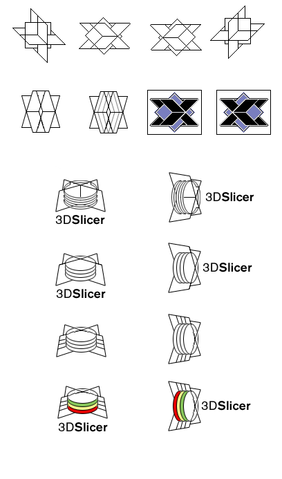
The above blue and black look a bit static and very powerful; they add that outside of the Slicer core values and I'm not sure that's appropriate; the blue and yellow variations don't convey that association as strongly. However, here are some additional sketch variations to throw into the mix... some of these experiment with the notion of slicing an abstract (not specificly brain-related) "dataset".
Series four
Ron's preference was for the bottom left sketch, with the RGB values of the red, green and yellow slices matching those of the different Slice windows in Slicer3. Below are variations on this sketch that use the coordinate frame to call back to the Slicer2 logo, and evoke dynamic interactive slicing of an abstract shape. At the bottom are two drafts of favicon images (these guys need more work, but this gives us an idea of whether we can resolve a version of the logo at such low resolution).
Series five
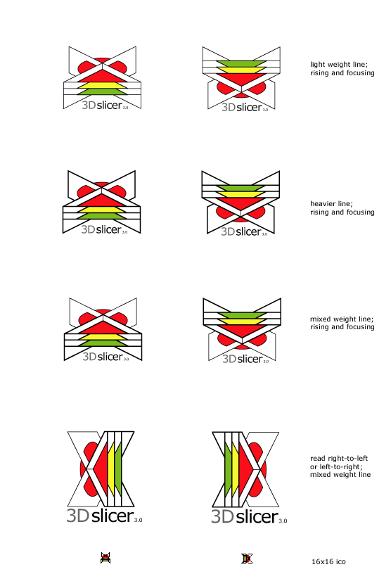
Feedback from series four from Ron and Steve: colors are too strong; The impression of "X" is also too strong; better if we can call back more closely to the original slicer2 logo's color and sensibility; and better if we can more strongly incorporate a sense of 3D data (like a 3D model). The series five workup below uses the coordinate frame from original Slicer2 logo in an orientation that doesn't emphasize the "X" shape, uses a more conservative color scheme that echos previous logo, and indicates abstract, organic (non-brain) 3D data and color labeling.
Font
The final font choice for the logo will be documented here.
Color
The color palette used in the final logo will be documented here.
Usage rules
The rules for displaying the Slicer3 identity will be documented here.
EPS versions
Color and monochromatic postscript versions of the logo will be linked here.
Return to TOC


