Slicer3:UIDesign
Return to Slicer3 Interface Design and Usability
Contents
Slicer3 design & usability goals
1. Enable a user to understand and effectively use the content and tools being presented;
2. Enable a user to accomplish a principle task by following an appropriate and satisfying workflow or a curiosity-driven exploration, at an appropriate pace;
3. Enhance and support the developer’s experience with GUI infrastructure and guidelines that simplify and clarify their work.
Core values
This is a working list of the core values the interface and interaction should reflect/support (please refine). These are not "specifications", but rather, think of them as concepts that our user communities would value highly and which would effectively and honestly distinguish the software. These are the concepts we'd like Slicer3 to strongly project:
- Simplicity
- Clarity
- Control & Precision
- Information-rich
- Open source & cross-platform
- Furthering scientific research
- Assisting treatment/therapy
- Advanced research showcase
- Easily extensible
- Interactive & responsive
- Reliable
- Longterm viability
Embodiment
Here's a link to a running visual blog highlighting progress in the Slicer3 embodiment.
Application color palette
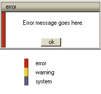
The draft slicer color palette is shown below (this palette will still evolve as the UI design evolves -- in particular to accommodate colors used in the final Slicer3 logo). Developers of code, web content and training materials are encouraged to make color choices for GUI components according to this palette, bearing in mind that some of the colors are linked with special meaning, such as error (red), warning (bright yellow), and system (mediumBlue) messages, and unsaved data in drop-down menus and selection boxes (warmMediumGrey).
| color | R | G | B | hex | use in slicer | |
|---|---|---|---|---|---|---|
| black | 0 | 0 | 0 | #000000 | ||
| white | 255 | 255 | 255 | #ffffff | GUI background | |
| darkWarmGrey | 96 | 94 | 83 | #605e53 | ||
| mediumWarmGrey | 139 | 136 | 120 | #8b8878 | unsaved data ? | |
| lightWarmGrey | 205 | 200 | 177 | #cdc8b1 | ||
| warmGreyTint | 238 | 232 | 220 | #eee8dc | ||
| darkOrange | 196 | 74 | 26 | #c44a1a | ||
| brightOrange | 224 | 111 | 19 | #e06f13 | ||
| brightYellow | 231 | 209 | 62 | #e7d13e | warning message code | |
| yellowTint | 238 | 214 | 128 | #eed680 | sag slice | |
| darkCocoa | 130 | 102 | 71 | #826647 | ||
| lightCocoa | 179 | 145 | 105 | #b39169 | ||
| stone | 224 | 195 | 158 | #e0c39e | ||
| stoneTint | 239 | 224 | 205 | #efe0cd | ||
| red | 195 | 46 | 15 | #c32e10 | error message code | |
| brick | 186 | 70 | 43 | #ba462b | ||
| lightBrick | 193 | 115 | 80 | #c17350 | axi slice | |
| redTint | 224 | 182 | 175 | #e0b6af | ||
| darkGreen | 68 | 86 | 50 | #445632 | ||
| brightGreen | 104 | 143 | 66 | #688f42 | ||
| dustyGreen | 138 | 165 | 111 | #8aa56f | cor slice | |
| greenTint | 204 | 244 | 166 | #ccf4a6 | ||
| darkBlue | 73 | 64 | 102 | #494066 | ||
| mediumBlue | 98 | 91 | 129 | #625b81 | system message code | |
| lightBlue | 136 | 127 | 163 | #887fa3 | unsaved data? | |
| slicerBlue | 179 | 179 | 230 | #b3b3e6 |
This prototype dialog box is an example of Slicer3's limited use of color coding:
Return to Slicer3 Interface Design and Usability
Design drafts
Initial visual sketches
Slicer's redesign effort should identify and maintain important UI conventions (helping users to transition more efficiently) and update and improve the design to enhance usability and user experience.
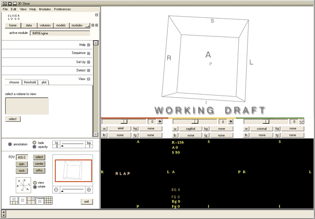
The first task is to redesign the main interface. Some UI conventions on the top-level Slicer2 UI are quite good and should probably be maintained:
- the default 3D + slice window viewer convention;
- the axial, sagittal and coronal slice windows and their controls;
- the 'slicer blue' background in the 3D window is a strong identifiable feature; if we can keep it, we should! (see notes below);
- a pull-down (or hidden until selected) list of slicer modules);
- the standard module UI panel, in which an active module's UI is displayed;
- the collection of navigator widgets and slice window faders on top level UI (keep, but improve);
It will be useful to add/change:
- a preferences menu in the menu bar;
- an edit menu in the menu bar to house "undo/redo"
- fwd & back buttons for switching between recently-visited modules
- a "home" feature as well, which when configured, will bring the user to the desired slicer module and view configuration;
- the UI distinction between slicer core and custom modules.
- an indication of keyboard shortcuts on menus
- the entire GUI should responsively resize.
In general, the visual design will still be constrained by the formal features of Tk, still at the heart of KWWidgets. Even with Tk tiles, it's unclear how far the appearance of widgets can be stretched. At very least, Tk tiles may be used to maintain a fixed look and feel across platforms, which is desireable.
The sketches below are early working sketches and will be updated as the designs evolve. First steps are to simplifiy the interface, enhance the functional groupings of features for clarity, add new (or expose) features, and to improve the overall appearance.
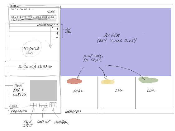
Early layout sketch:
The sketch shows a draft plan for spatial arrangement of the UI which conforms strongly to Slicer2's comfortable conventions. The default 3D viewer and slicer windows are present and arranged in the familiar fashion, and the color convention that encodes axial, sagittal and coronal slices is maintained (though the hues will change a little bit). On the left, several logical groups of widgets are established and assigned to a GUI panel. The entire left GUI panel should be horizontally collapsable to allow the 3D and slices viewer more screen space. The entire window should resize in a responsive way.
Bottom-most on the GUI panel is the viewer configuration and 3D navigation window. Above that, widgets that control the display of slice windows are grouped. Above that is the panel that contains the GUI for the current active software module. And top-most is the panel that reports which module is currently exposed through the GUI and buttons that let the user navigate to other software modules. The combination of slice and viewer GUI panels should be vertically collapsable so that a module's GUI can have increased screen space.
In the GUI's top panel, only "home, data, volumes, models, and modules" are exposed. Other commonly used modules in the core, (Alignments, Editor, ModelMaker), currently exposed in the top level UI panel, can be listed under the "modules" button in Slicer3. This simplifies the GUI's face and eliminates a potential confusion about which is the "current module" populating the module GUI panel (elaborated below). If it remains important to distinguish core from custom modules, color or font coding can be employed in the modules menu. A user can still navigate to these core modules easily (click, pulldown and release, rather than one-click), and any of these modules can be assigned to the "home" button so that Slicer3 will start up with that module exposed as current. The status report in this panel will always report the current active module, whether core or custom. Simple "forward and back" buttons can allow intuitive navigation, for instance, from the "vtkDTMRI" module to the "alignments" module and back again.
Slicer's logo can be statically displayed in the GUI panel rather than occupying the navigator window when the mouse is elsewhere, and occluding the useful spatial context it provides. The navigator panel, if implemented well, can effectively eliminate the "where'd my model go?" problem that non-expert users sometimes encounter.
In the module GUI panel, options arrayed as tabs in Slicer2 are now displayed in collapsable sub-panels arrayed from top to bottom. This relieves the pressure for space encountered when using horizontally-arrayed notebook tabs, and eliminates Slicer2's workaround "more" tab. (The vertical stack of panels can also coarsely represent a workflow, when that convention needs to be reinforced.)
Slicer-blue versus white 3D viewer background?:
Slicer2's 3D viewer has by default a background color that is distinct; images generated with the software are recognized as "Slicer" images in part by this background color, and also by the default window layout (one 3D on 3 slice windows) they depict. The background blue may also help disambiguate white features in the data from the void of the background. Keeping this background color convention is something we'd like to do.
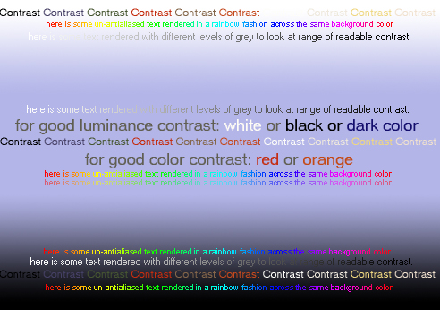
Having a medium-high-valued luminance, the color does pose some limitations on the display of small textual annotations with good readable contrast in the 3D viewer. In Slicer2, annotations in this space are rendered readable in at least two ways: by making them large and bold, or placing them on small polygons that lighten the area behind the text. Both of these are compromises; annotations take up more space in the view than is necessary, and they are assigned a look of importance that's not conceptually justified. Ideally, we'd like to display clearly readable text in a range of sizes and colors in the 3D viewer, both to support visualizations of complicated data in a subordinate way, and as actors populating an information space in their own right.
A quick exploration of the challenge is illustrated below. Avoiding equiluminant colors is important for good readability no matter what the background color. On the blue background, it appears the best color contrast is given from colors in the draft Slicer3 palette ranging from "black" to "brick" whose value is low and/or color contrast is high. Highly saturated red and magenta contrast well too, though their garrishness gives them an almost "alert" visual priority. For small text, black or dark grey is probably best advised. However, to render a multi-colored textual information space, changing the background color in the 3D viewer to white is probably the best way to avoid some hard-to-read labels.
Slicer main window
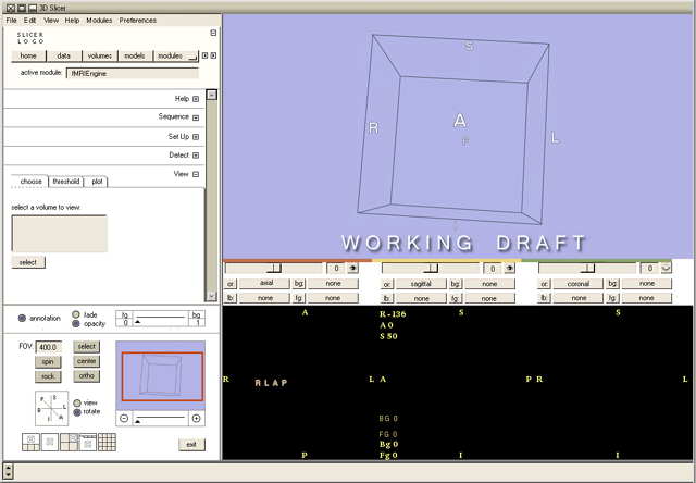
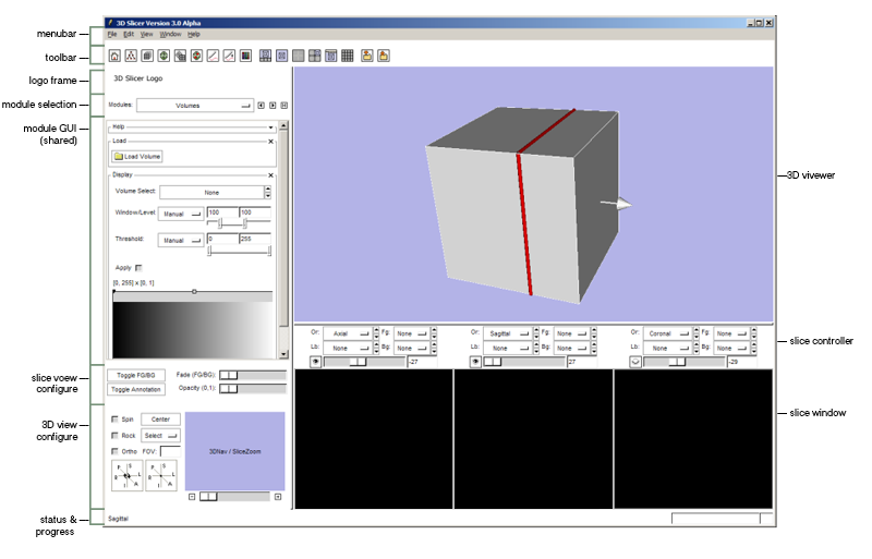
Slicer3 main menu working draft and one variation with a white 3D viewer are shown below. This draft is working out logical groupings of GUI functionality and converging toward a draft design. This design adheres to a traditional Tk (and BLT) look, which is more dated than we'd prefer. In a future draft, we'll modify the design of core widgets as the upcoming new release of Tk and/or Tk Tile will permit us to put a more modern (and hopefully platform independent) face on the GUI.
In this sketch, the GUI background is rendered as a clean and pristine white, is kept as uncluttered as possible, and incorporates color sparingly, for grouping related components, and to encode certain concepts (such as "selected", "active", "unsaved", etc.). Use of the hairline helps to make the layout appear sharp and precise. Window title bars are shown using Slicer3 palette's warm greys, with a soft gradient to give them a little distinction from other elements (disambiguating the title bar from the rest of the GUI can help a user to easily target it with the mouse to move it around a busy screen.)
Ideas from the sketch above were incorporated and have been modified and refined. In particular, GUI has been partitioned into the following logical chunks:
- file menu
- toolbar for quick navigation to common-use tools
- space at top for Slicer logo and other contributor logos
- module navigation panel
- (shared) module interface
- slice window configuration panel
- view configuration panel
- progress bar & message panel
- 3D view window
- 3 (Axial, Saggital,Coronal) Slice windows
The entire side gui panel can be collapsed or reset using the "expand/collapse" icon in its upper right corner. A keyboard shortcut will also toggle the GUIs visibility. The file menu adds an "edit" option (to contain undo/redo functionality) and a "preferences" option (to save settings like a "home" module and preferred view configuration), in addition to those that already exist in Slicer. Forward and Back icons have been added next to the "module" pull-down menu, so that a user can easily navigate between modules recently visited.
Prescribing dual functionality to the slice window slider, depending on a mode switch, to dial slice opacity or crossfade seems natural and compact. Bringing the ability to turn on and off annotations in the viewer from the main GUI panel is also handy. A more elaborate navigation window is shown (based on Photoshop's) and a re-do of the "rotate around" or "view from" axis icons is presented, without the rendered head in Slicer2's version. These have been combined into one, for a more compact solution. For clarity, when the "rotate" mode is selected, mousing over "A" or "P" in the icon will highlight both; same for "R" and "L", and for "S" and "I". When "view" mode is selected, only the "A", "P", "R", "L", "S" or "I" under the mouse should be highlighted. Finally, five configurations are selectable for the main viewer: default 3D over Axi-Sag-Cor; 3D only; four-up; saved view notebook; and lightbox. Selecting any one of these should switch the viewer's configuration.
In general, the sketches remove all literal images of human anatomy from the interface; while Slicer's software modules are designed primarily for medical data analysis and visualization, other research domains should certainly feel comfortable developing and using custom modules suited to their applications, or use existing modules with different types of data.
The sketch incorporates the primary action patterns that have been identified in Slicer's UI: narrative (serial workflow coarsly represented in the module GUI panel), high-density information display with direct manipulation, a status display (current module, progress bar, system messages), a navigator window for maintaining spatial context, and a control panel for configuring the view, configuring and executing data processing.
Notes: the color "stoneTint" in the Slicer3 palette, used to delimit entry widgets, buttons and listbox, is still too pink and we want to depart from Slicer2's pinkness. Need to take this color more toward a cool light brown or a warm light grey (same thing?!)...
Early (working) design of GUI panel full resolution:
Toolbar with icons
Ron has requestsed a persistent toolbar for one-click navigation to commonly-used slicer utilities and modules. We are implementing this now in the Slicer Main Window. Below is a design draft for icons to be included. The slice plane visibility icons are not meant for the toolbar -- these texture a pushbutton in the Slice Window Controller and switch (visible/invisible) to display the state of slice plane visibility in the Main Viewer.
GUI layout and functional organization
to-do: need to modify visual presentation to make different sections more visually distinct and color-code three main slice windows!
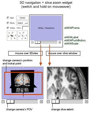
Below is the sketch for behavior and appearance of the 3DView navigation and slice zoom widget. During the MIT project week in July, we'll work on the code to implement this widget.
Visually distinguishing GUI sections
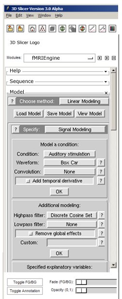
It would be useful to apply a compatible but different style to Module GUIs to improve the visual parsing of the overall Slicer GUI. The image below is a mockup; we'll discuss this week how something like this might be implemented this using the vtkKWTheme infrastructure.
Current (.cxx) implementation:
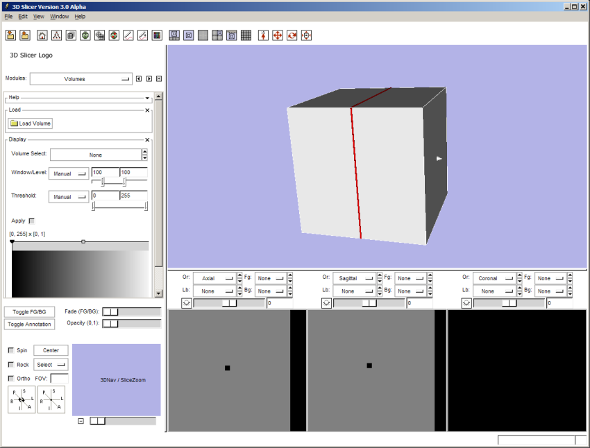
Updated screenshot of slicer3 GUI:
The toolbar now includes four separate toolbars, one for commonly-used modules, one for different view configurations, one for loading and saving and one for experimenting with setting mouse modes in the 3D view window. Each icon has a tooltip that describes what it represents on mouseover. The row of buttons for navigating to commonly-used modules has been removed, since it is now redundant -- this saves valuable space.
In addition, the View Control GUI panel is being populated with widgets that are active on mouse-over, and allow a user to configure the 3D view with one click, or a click-and-drag.
Return to TOC

