2011 Summer Project Week Breakout Session VTKCharts
Goal
In this session we will present the the 2D charts available in VTK. There are a wide range of charts, such as line plots, scatter plots, bar graphs, pie charts, 2D histograms and parallel coordinates. The charts are built on top of a feature rich 2D API, and 2D scene. They feature full interaction, OpenGL accelerated rendering, legends, tool tips and pipeline integration. They are already used in several projects, including ParaView.
Content
- Demo of current functionality in VTK
- Hands-on tutorial - using the charts in an application
- Advanced interaction and chart matrices
- Linked selections
- Future directions
- Discussion/Q&A
Primer
See VTK charts Source article for some background, although many new features are present in VTK 5.8 that will be shown during the breakout session.
Slides
The slides are available. Please note that full example code can be found in the VTK repository under Charts/Testing in the Cxx (for C++) and Python subdirectories. These tests are compiled on all major platforms, with image based comparisons verifying results. They are written to be examples, it should be noted that they explicitly disable all antialiasing to make the image comparisons more reliable.
Chart Type Examples
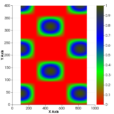
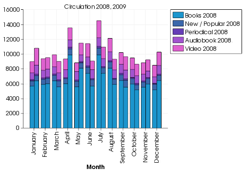
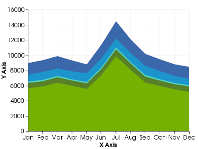
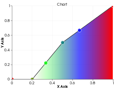
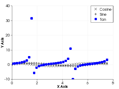
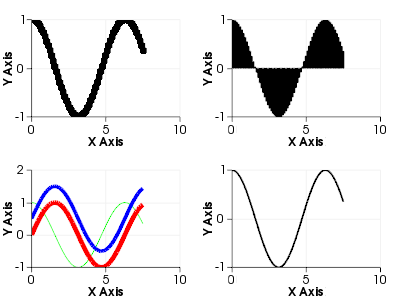
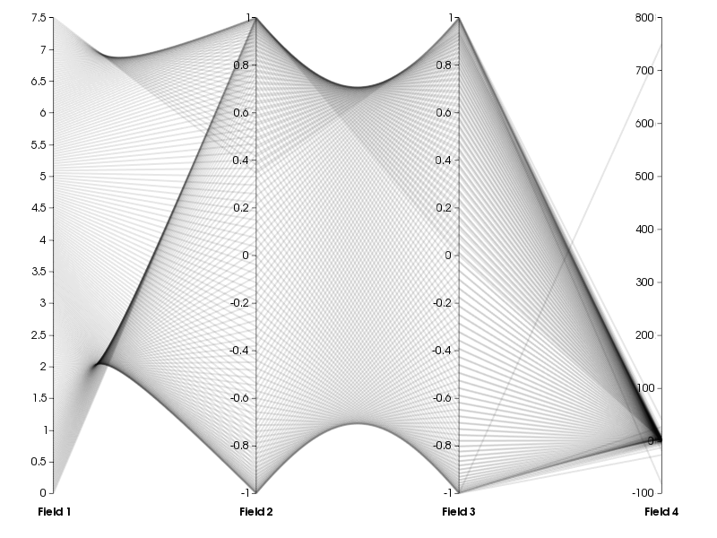
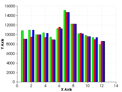
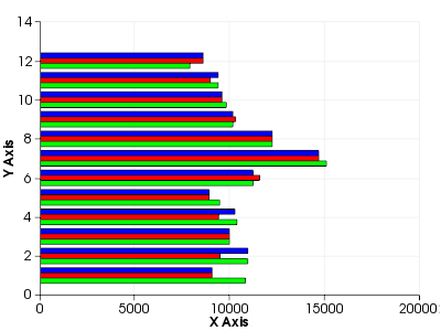
The VTK charts support a wide array of different chart types. Many examples are shown below, and are generated from the regression tests. For example code on generating images like these take a look at the regression test code.
Examples of VTK Charts in Use
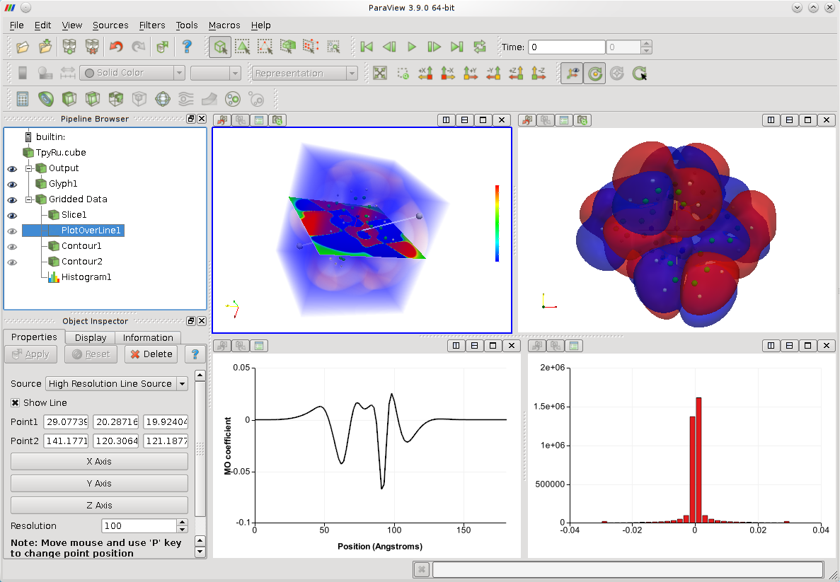
The VTK charts are used heavily in ParaView for the analysis of large data sets. Below is a ParaView session with a line plot and a histogram of molecular orbital values. The charts in the ParaView framework are able to display time-varying data, participate in VTK data pipelines and offer all of the normal panning, zooming, selection interactions in addition to some advanced features such as up to four linked axes per chart.
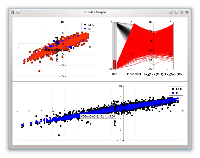
They have also been used in various other projects to visualize a large array of different types of data. Shown below is a Qt application with three linked chart widgets. The top two charts (scatter plot and parallel coordinates) control a linked selection showing various fields in a table. The bottom scatter plot shows only the selected subset of the data. Individual data points can be clicked on, and an event is generated giving application developers access to the table row of the clicked point. Note that tool tips can also display custom strings for each point, in this case a unique identifier for each chemical in a database.
