Volume Rendering and Loadable Modules: (Engineering & Usability Notes)
From NAMIC Wiki
Home < Volume Rendering and Loadable Modules: (Engineering & Usability Notes)
Contents
Volume Rendering
Slicer 3.4 Release Priorities
- Fixing the progress bar
- Software rendering is slower now that it was in previous version. Need to make sure that performance is optimized for release.
- Oops i found a crash; will note this in mantis. After a volume is selected and volume rendering is set up etc., selecting 'None' from the volume selector in load panel causes a crash.
Additional issues
- When a parameter set is selected, a request render event needs to be triggered so viewer is updated
- When a render method is selected, a request render event needs to be triggered so viewer is updated
- Render options should switch on the selected renderer so that inapplicable options are hidden, and only relevant ones are exposed.
- In the 'Help' panel: would be nice to describe each render method so that they are demystified
- In 'Details' panel: when switching to a new tab, need to keep scrollbar position in the tab being exited, so same view is displayed next time user returns to that tab.
- Similarly, when navigating among modules, would be helpful if VR module's scrollbar position was maintained (use exit/enter methods?)
- In 'Threshold Tab': the widgets could communicate the options better. Currently, the threshold menubutton's options (ramp, rectangle, none) set up an expectation that reverting to the 'none' option after applying ramp or rectangle, will remove the thresholding operation. To communicate the underlying functionality more accurately, maybe simplest fix is to just remove the 'none' radiobutton from the menu, and select either 'ramp' or 'rectangle' as the menubutton's default value. Then, as soon as a user adjusts the range widgets below, the threshold is applied. If they wish to revert, they can select Slicer's "undo" (if the operation is undoable).
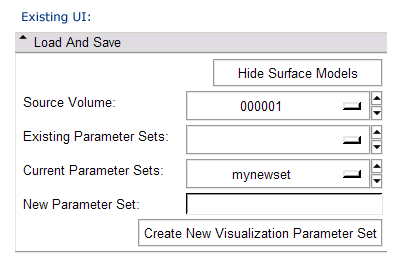
- In 'Load and Save' panel: Can we save parameter sets?
- BUG: Sometimes when you switch between Rendering Methods, the change doesn't seem to take effect.
- In the 'Advanced Tab': Get rid of the 'interactive apply' button -- just always do that by default. OR, change the default state to selected.
- Need more pre-defined Parameter Sets with appropriate color LUTS and parameters sets including
- MIP (black to white or blue to white, maybe with window/level set appropriately for the dataset)
- CT/Angio (there are industry standard color LUTS and xfer funcs, check Fovia's website for example).
- Some kind of "Label Map" mode, useful for interactive segmentation, parameterized to maximize speed.
- Software raycaster used to be multipass and interuptable (still interuptable we discovered, just slower). Old behavior was preferable.
- BUG: Ron did the following, which should be investigated:
- selected a non-None option in the 'Threshold' tab,
- then selected another tab,
- then came back to 'Threshold' tab
- and the Threshold option was set to None
- In the 'Performance Tab's' GPU Raycasting options, 'Enable Lighting' should be selected by default.
- In the 'Performance Tab': in each set of options for configuring the Rendering Method, use a vtkSlicerPopUpHelpWidget to explain what each option is, and what selecting/adjusting it will do.
- CUDA rendering is crashy -- should we provide some visible disclaimer?
Some extra thoughts for 'nip&tuck' improvements
- Maybe there's a reason that 'Hide Surface Models' button is in the 'Load And Save' panel; if it doesn't need to be here for load/save reasons, it should be moved down to 'Details' panel something like this:
- Ron: We should make sure that 'Hide Surface Models' includes tracts meshes and other more exotic constructs.
- The GUI's vocabulary is appropriate for developers, and less so for users of this rendering functionality. Suggestions for making it more user friendly:
- rename 'Details' panel to 'Volume Rendering Options'
- rename 'Performance' tab to 'Method'
- rename 'Parameter Set' to something less programmery -- possibilities:
- Appearance
- Style (i like this one best so far i think...)
- Presentation
- Template
- nix the 'Performance/Quality box entirely. Expose Rendering Method selector at the top of the tab, making it the main point, and switch display of other options based on what's selected.
- use a vtkSlicerPopUpHelpWidget to explain the options and speed/quality tradeoffs for each rendering method.
- When no data is loaded or no source volume is selected, the 'Details' tab is unpopulated. This can be confusing to a newbie user (it was to me first time thru -- I thought the module didn't have any functionality to offer or maybe there was a bug in the code that built the GUI). At least a text widget could be displayed there saying that a volume must be loaded for volume rendering options to become available...
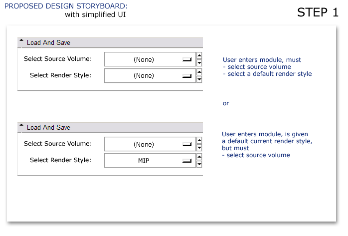
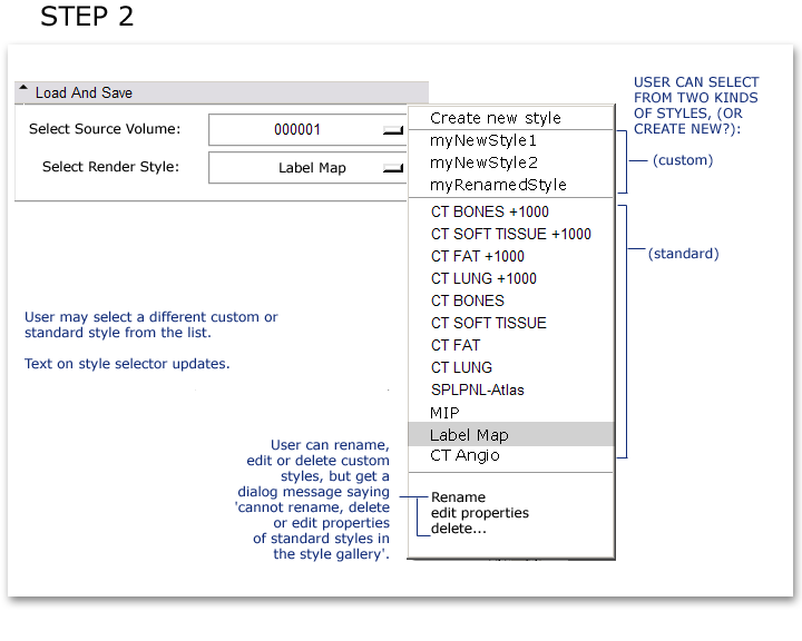
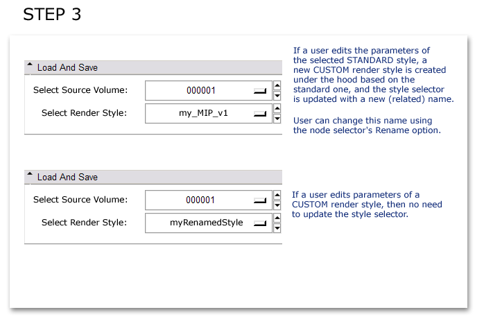
- 'Load And Save' panel: It took awhile as a new user to understand the difference beween 'Existing' and 'Current' parameter sets, and how to understand the implications of choosing 'parameter sets'. how about something like this to simplify the 'Load And Save' interface:


